

Blog

Keep updated with HAD-PRINT

The hidden difference in good print.

So, you’re about to invest in some print-based marketing to help you achieve some physical touch points with your customers. However, you’re looking at the budget and thinking, well I can save some wedge here… Wrong! For anyone with an ounce of common sense, this article won’t be a shocker. It’s the old adage of what goes in adds up to the net result. It always surprises us, when people want absolute top-notch results, and provide artwork for print from the likes of Canva or Publisher. Ask any good professional, and the answer will come back as a resounding Adobe CS suite, in particular, for page layout Indesign and Illustrator. Let’s unpack why…

Downsides of Canva or Publisher…

  • • Dubious standards of PDF creation within these applications. Adobe invented PDF and when written to the right standards, no issues with fonts behaving differently, colour spaces (or ICC profiles) which reflect the end result are properly curated into the PDF
  • • Let’s touch on it, both of the two applications mentioned above, don’t have a fine pedigree with nicely finessed typography. The Adobe CS suite maximises the features within OTF (Open Type Fonts), which provides exceptional tracking information on the spacing between characters and utilises the ligatures properly within the additional characters that exist in OTF fonts. Also remember that Adobe was the creator of Postscript fonts in the first place, so the pedigree is there again.
  • • Colour management starts well before the creation of a PDF for print. How colour is handled whether it is RGB or CMYK (best for print) or other colour spaces. Adobe has influenced and set standards for colour management since the 1990s at the start of desktop publishing.
  • • The tools within PDF creation for print within these applications are very limited, again Adobe CS suite makes bleed and trim marks effortless, without any forethought.

So, the other downside of the tale is when someone has all the tools and doesn’t know how to use them. Yes, you can have Adobe CS suite, however, knowing how things work goes a long way.

  • • Image preparation – finessing the detail, and knowing how you make the right technical tweaks can go a long way from average to stunning. We’ve retouched images which needed detail carefully added back in, getting the tonal balance right, and understanding the limitations of the print process for highlights and shadows. Within recent history, it was known to have specialists for this job to maximise the results from scanned transparencies to produce results which were crisper than sharp and visually said wow on the page.
  • • Accept that certain items like logos should be vector-based artwork; such as .eps .ai .svg and certain types of .pdf – a vector graphic is a mathematical format which describes key points on the outline and tells where to fill with colour or what stroke width to apply. Why are these great; they scale and remain sharp at whatever size you use them. No raggy edges from bitmap raster-based formats which don’t scale.
  • • Without sounding old, the art of good typography is dead. Back when I was a junior in graphic design studios, senior designers would issue substantive scorn on poorly tracked, kerned characters in typeset copy. The text should flow and connect with good spacing which aids the reader to enjoy reading said textual copy. Again Adobe CS suite allows this to be handled with ease. (also add in Quark Xpress for anyone still using it!)

Design your page for how it is going to be produced, I was taught about designing for the medium of production. Unfortunately, these days aesthetics override considerations of the HOW. We use to have to consider when designing a brand of communications how they were going to be produced. Silk Screen print was still big in the 1990s for large format billboard advertising, limitations of entry-level small format litho printing were totally different from commercial colour litho, however, the entry cost points also reflected this. Designing to meet these criteria along with the client’s budget and also maximising the result.

We can instantly pull out a piece of artwork, which we know has been artworked up properly (or pukka as we say) – it stands out as effortless, it just works. We can always identify the artwork (even before we’ve looked at the metadata on the file which tells us how it originated) which just has small tell-tale giveaways. We know when we see a file from MS Publisher, colour space will be an issue, the colour will shift from corporate colours in RGB (Microsoft’s default colour space) to CMYK, fonts will look uncomfortable on the page, and yes, we’ve seen horrific things to type from Publisher, with additional strokes to embolden beyond Black or ExtraBold fonts.
Equally, we know that the definitions on PDF files from Canva are dubious, with it struggling to define the Art Box / Bleed Box / Trim Box / Media Box / Crop Box’s within the page description in the PDF file – sorry very technical there. PS Canva isn’t big on colour management either.

So as with anything fine in life, the result you get boils down to the quality of what you put in. I will accept over time perhaps the dreaded Canva might get better, however, initial impressions are very limited. So if you’re specifying for print with good results, think about the how, – how it is created, how it is going produced as a physical item, this will affect some thinking. Equally, don’t ask a web design agency to artwork your print… we don’t get involved in web online stuff, as we are professionals in print. Good artwork/design people for print, have decades of working in the environment and knowing how materials will handle different ink coverages. A good print designer / artworker will make very good suggestions when specifying what paper stocks and finishing processes to enhance the end result to maximise the result in line with the design and artwork.

So, why this blog now, we’ve seen some shockers over the past few weeks, call it therapy, if we don’t walk about it, we’ll just get grumpy. So, if you want stunning print, ask us at the beginning. It’s our trade, we’re not agency wallers pumping it to an internet shed, production is on-site, real live for us – real pukka print.
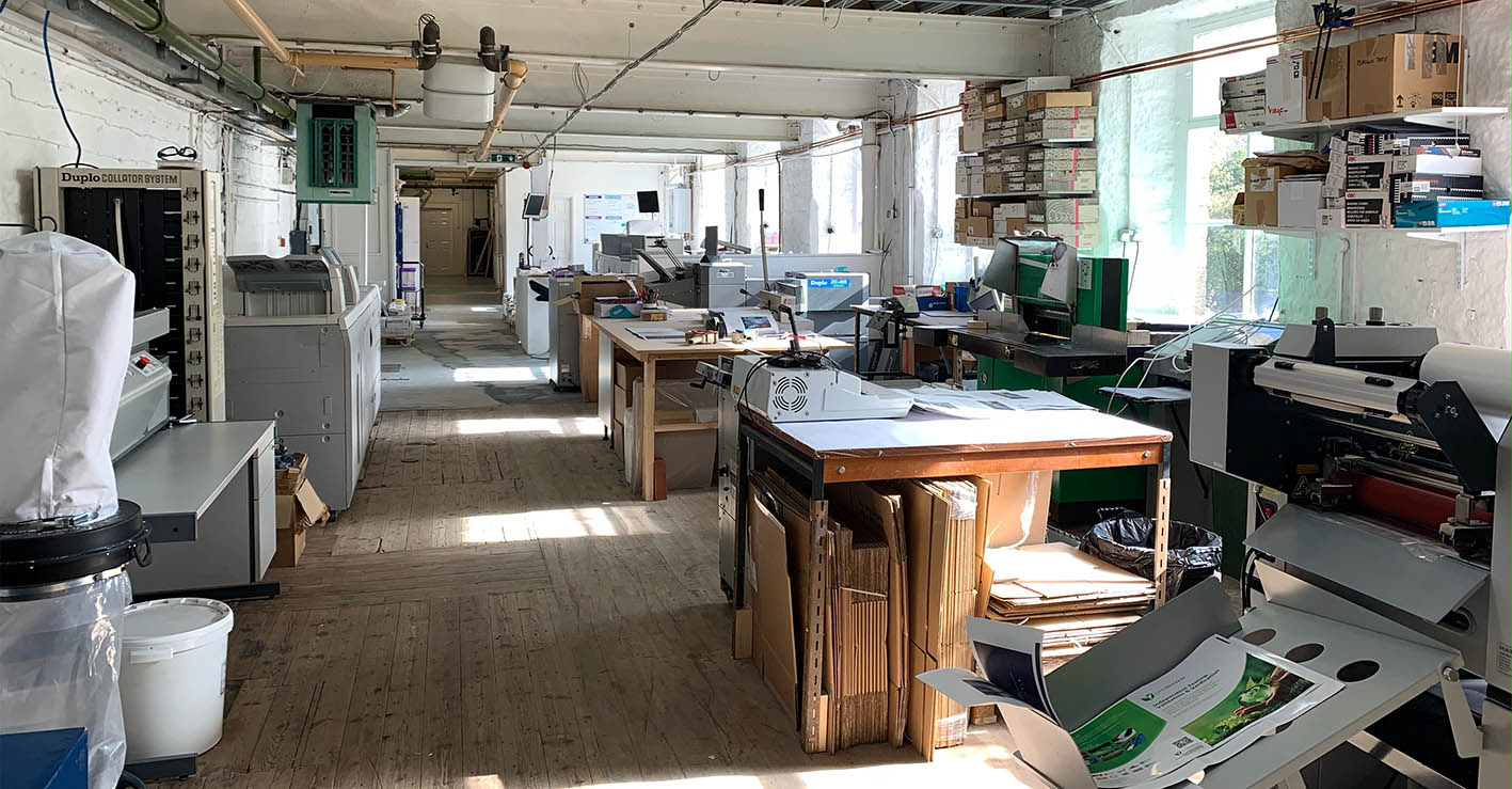

The big question… Why?

In an age where buzzwords and rhetoric spin around endlessly. Falsities around being kind to the environment by using electronic communications bluff their way into everyday life. Why does print or physical marketing matter?

We exist to provide the following

  • • enable successful businesses/organizations to engage with effective physical touchpoints
  • • assist SMEs / charities to deliver effective physical branding to enforce their presence in their primary customer touchpoints
  • • enable more accountable communications with known carbon footprint materials

What drives us… in a physical world, where being seen is a significant challenge. The reality of physical provides a great opportunity to help SMEs and third-sector organizations to create reality, and retention whilst resonating with an audience in a meaningful way.

The power of print, aka physical marketing, lies in the ability to connect. Connections are created through, the impact of the message; evoking the senses, visual and touch. Print through its lesser utilization due to mass market digital communications being cheap and overused, means print holds a unique power of trust, and reality, there at the moment, with no distractions. When coupled with creativity in a proper design, and well-written content, it has leverage in a very different way. Add in personalized or localized to make the message even more relevant to the recipient, and the engagement level increases further.

As a multi-disciplinary print provider, we don’t just print on paper, but everything through to large format items like banners and signage, through to garments and apparel. Delivering a wide range of physical items ready to take your brand. Delivery of this range of items, allows us to support our customers more fully in delivering their message, even just reminding people of who they are. Of course, this can be subliminal, working in the background.

We don’t live in silos, unlike some graphic communication providers. We know and understand the power of connecting digital communications with print. We don’t profess to be experts in digital communications, however, understand what you can do. Hence why you won’t find us selling websites, social media support or other digital products. At the heart of what we do is the power of physical media through print. We understand the paper, and the nuisances of print finishing, which allows us to better specify strong campaigns and items in print.

Don’t think we are not connected, we do understand marketing basics, we have professionals in other disciplines we love to work with. We will ask, what is your call to action? How do you want to measure or quantify parts of marketing tools? How are you distributing or connecting with people who might be your ideal audience? These aren’t hostile questions, purely us making sure you have thought through a customer journey, where are you wanting them to go next and why.

As for being accountable, we can identify sources of paper, substrates, garment stock and pretty much everything that flows through our print studio. From the shortest journeys of Kendal to Preston and us in Halifax, or paper manufactured in Portugal. With toner which is compostable, latex large format ink. We are well aware of every item we use in our processes. We’d like to challenge you to think of the carbon used in digital communications- you’ll struggle to fully identify every element or resource used.

Above all, we care about what we do, try to be properly responsible, and have some ethics along the way. Perhaps we are an exception to life in modern business society, we aim to be credible, through being responsible. We work best when in partnership with our customers, helping them to achieve whilst delivering progressive development for all involved. Making us part of the bigger community, valued and adding value where we can.

Blue Monday, can it be a better Monday?

Blue Monday (16th January 2023) might be a grotty Monday in January but thinking about it beforehand might just get you feeling more zingy and ready to go. Stuart outlines his thinking on ways to beat blue Monday.

1.         Physical activity. 

Might be the hardest time of year to get out and do something, but I have a goal in April, which needs some attention to make it one to be proud of. It might only be the Blackpool 10k – but training now makes the result even more worth it in the end.

2.         Set a realistic resolution. 

I’ve had some goals for a while, personal to me. Some are business related and some are personal, yes, the above might be one of them. However, looking at the steps on the journey, and looking at the measures towards them is so important. You might not hit where you want to be, however, what progress have you made, how is quantifiable the small wins are also important.

3.         Get creative.

Different people have different forms of creativity, do something which takes you away, zone out, and concentrate on something different, whether for business or pleasure. And share it with someone! The art of making someone else smile from something you’ve done is very rewarding.

4.         Eat well. 

You are what you eat. Yes, we’ve just had a season of self-indulgence. However, eating well doesn’t have to be a sacrifice. If you need top tips on this speak to Lisa Kempster – she always makes me smile, Lisa’s nuggets of wisdom when it comes to food are a real eye-opener.

5.         Make the most of natural light.

For me, it’s time out walking the dog. Probably the best thing that I and my partner did, he brightens us up every day. Even the wet drizzly ones, yes, we all hate going out in the rain – even Finn our Cockerpoo – clearly doesn’t like getting wet!

6.         Change your environment.

Small changes can make a big difference. The view from your desk or workplace. Our print studio looks out over the Hebble valley, and this made a big difference to us, looking at trees rather than Kirklees College where we were in Huddersfield. Watching the seasons is very magical.

7.         Consider a SAD lamp.

As a trained photographer, I am well aware of natural light, it’s something many people take for granted. Light affects us in many different ways, moods, as we all feed differently off the light. I know I am more vibrant in the spring. So if you do suffer from Seasonal Affective Disorder – consider a light source which has the right colour tones in it for you.

8.         Spend time with others.

I know I am so lucky to have a small inner circle who really does make a difference for me. I hope I do for them.


Our Group Of Companies

        Office Equipment Solution  •   Business IT Services  •  Bespoke Print Solutions   •   Technology Repair Services


    We challenge change. We source solutions. We evolve together.


© 2013 - HAD-GROUP.  All rights reserved.